Paultons Park Website
Redesigning the website of the UK’s number 1 theme park for a modern day audience.
Back to My Work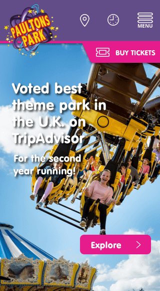
Redesigning the website of the UK’s number 1 theme park for a modern day audience.
Back to My Work

CLIENT
Paultons ParkDATE
2017-2018
ROLES
Website design
UI design
UX design
COLLABORATORS
Web developer Head of digital Marketing manager Graphic designer
Paultons Park had come to us after some customer feedback showed users were struggling with the website on mobile devices. The desktop focussed site combined with Google analytics data backed this up.
We completed a full site analysis to determine pain points and I created wireframes for a mobile friendly solution. We updated the user flow to encourage a quicker purchase process which in turn led to a 150% increase in sales on the website in the first few months.
Research and analysis, Wireframing, Sketch, Prototyping, User testing
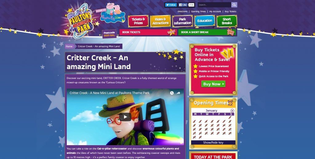
The previous website. Very graphic heavy.
Paultons Park has held their incredible Tripadvisor title for 5 years, a testament to park which unfortunately wasn’t matched with their website.
The original website used a lot of large graphics which slowed down the site, effected SEO and created a lot of busyness on the page. Pages had a lack of focus and hierarchy was very inconsistent. I had to be careful to create a design that kept the “magical” aspect of the park but refine the look and usability of the site.
I worked with the head of development to help create a strategy. We started by looking at Google analytics results combined with HotJar recordings which provided some excellent insights.
One of the key insights we found was the lack of mobile optimization. The large image sizes combined with desktop focussed layouts meant the experience on mobile devices was poor. I spent a great deal of time looking at HotJar screen recording to try and spot any consistencies which produced a lot of results. I found a lot of issues related to user flow, such as extra steps which acted as a metaphorical “speed bump” on the user's journey as well as UI problems which seemed to leave users confused with what they could engage with.
One example of a usability issue was the recording that contained multiple failed attempts at accessing the address by clicking the postcode. This occurred on other occasions which is a prime example of many where the users experience was impeded.
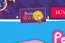
What look like an obvious route to the map.
In another example we see issues around the UI and lack of design clarity. Lots of elements where designed with inconsistent design states so users would often be unable to tell which items they could interact with.
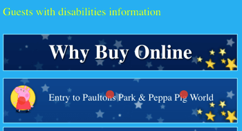
Elements that look clickable because of inconsistent design.
Once we had created the review, I began working on a journey map based on the current flow, so that we could make comparisons with our proposed changes.

The “before” User flow with issues
Once we had created the review documentation, I began working on a journey map based on the current flow, so that we could illustrate some of the issues customers were having. I also created a sitemap which we could then contrast with our proposed site map. The key improvement made at this stage was the improve user flow. The previous journey users took would involved extra steps that were unnecessary.
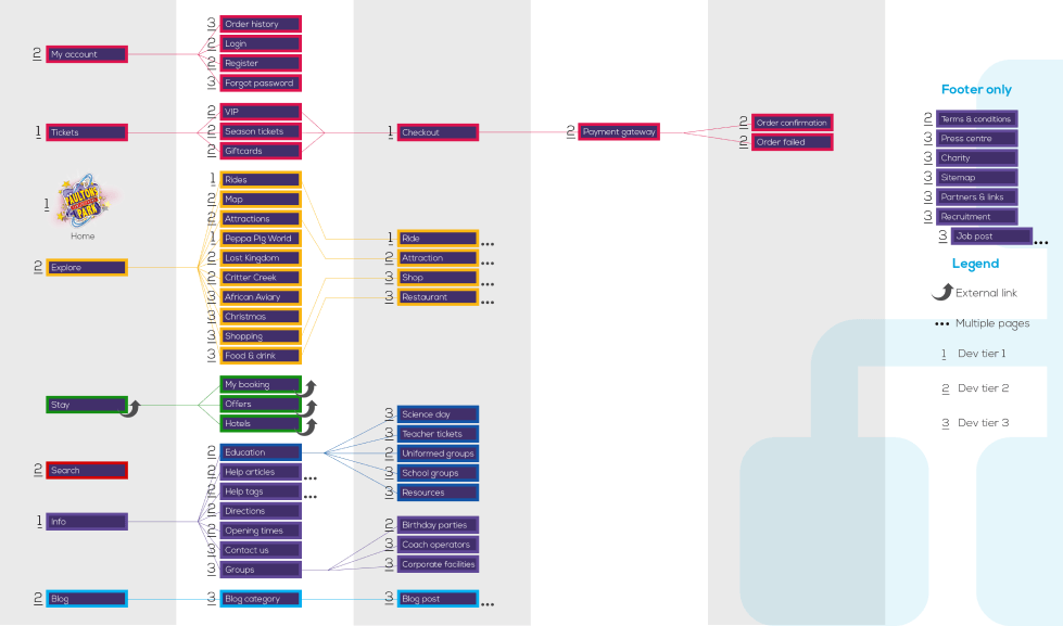
Proposed sitemap
After the suggested changes were approved, I began working on wireframes and designs for the website. The focus started with mobile designs due to the need for a responsive site.
The first part of the design consisted of creating a library of assets so I could re use assets throughout the site. I removed a lot of the extra graphics which took up screen and bandwidth space and replaced them with company imagery which could be optimised and still provide a good contrast between white space and the content. The calls-to-action were also updated in the asset library so they could be part of a clear hierarchy.
I created a clear navigation that provided quick access to some of the features users expected to see and access most quickly.
Although the project ran on longer than planned, the client maintained the extra time spent testing and reviewing the analysis was valuable. The project went live in 2018 and has seen excellent results including over 150% increased sales in the first three months and improved Google analytics results.
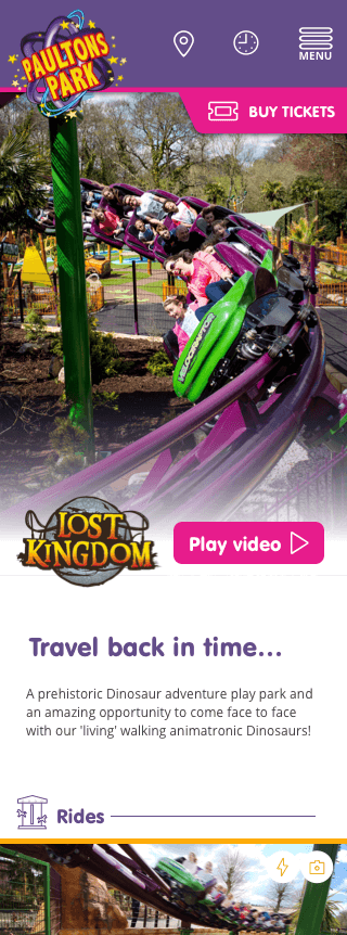
Visual of the Park section
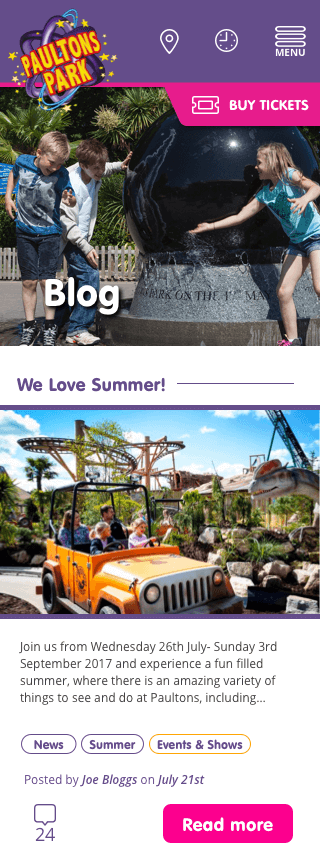
Visual of the blog.
Giving managers the power to create dynamic audiences for their content and save time doing it.
Read more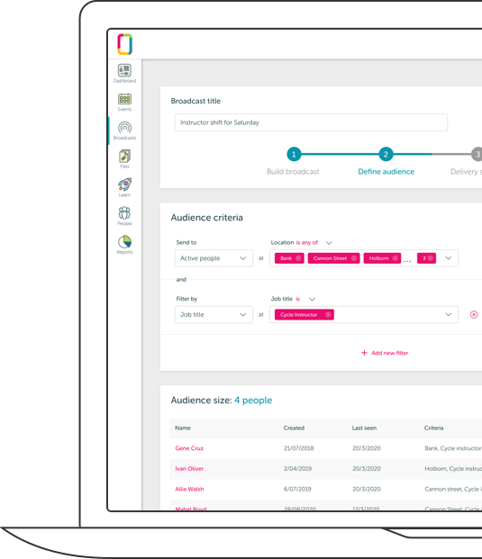
Improving the ability for users to be able to access, interact with and manage events in the OurPeople app.
Read more