OurPeople Events
Improving the ability for users to be able to access, interact with and manage events in the OurPeople app.
Back to My Work
Improving the ability for users to be able to access, interact with and manage events in the OurPeople app.
Back to My Work
When it came to organising events like cover, training and meetings in the app, our users had voiced their frustrations many times. After some initial interviews, it was obvious that finding events they cared about was too difficult. After some analysis and planning, I tested multiple iterations and included the feedback in our final solution. Finally, I created animated and static visuals for the development team to use.
Research and analysis, Miro Wireframing, InVision Prototyping, User testing, Sketch, After effects
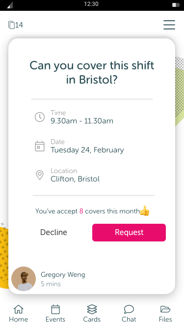
A typical cover card.
As a deskless workforce communication tool, one of the key reasons the product existed was to facilitate physical and digital meet ups. Users can do a range of things involving events including:
The biggest problem user’s experienced was that events were listed in chronological order so doing simple things like finding an upcoming event was really hard to do as the list was based on the date it was sent and not the date of the event.
To start things off, the product owner and I conducted interviews in order to create our user goals and requirements. After completing a competitor analysis to look at other practices, I generated user stories and user flows which included general and administrator level users.
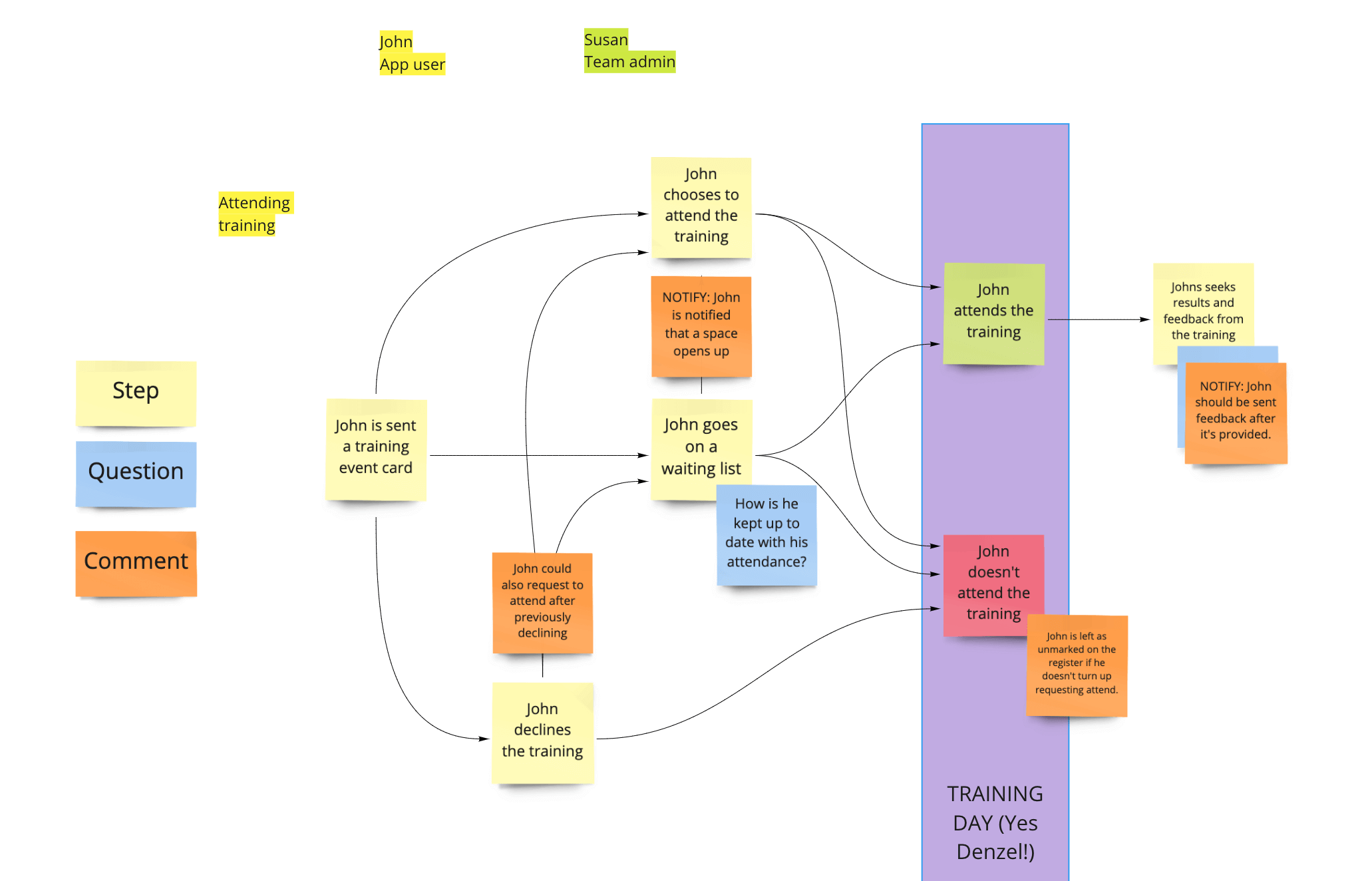
User flow for an app user.
Based on the goals and the user flow, I created a wireframe which would act as our base for the design going forward. I then based the first prototype on the wireframe which would be used in the first stage of testing.
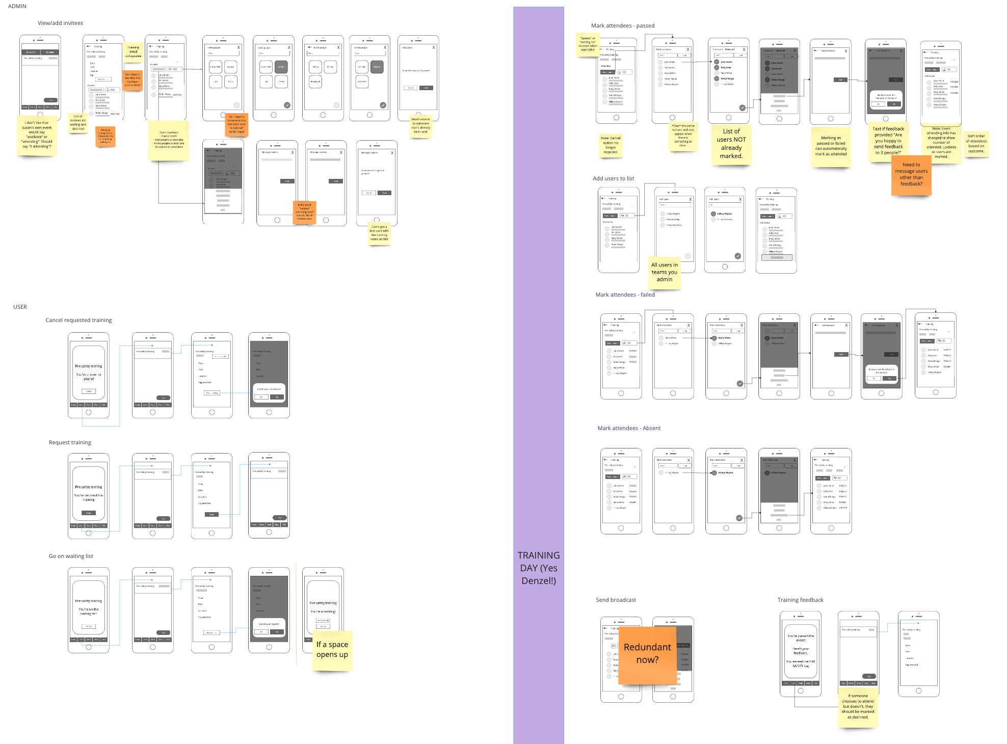
Wireframes of the first design iteration.
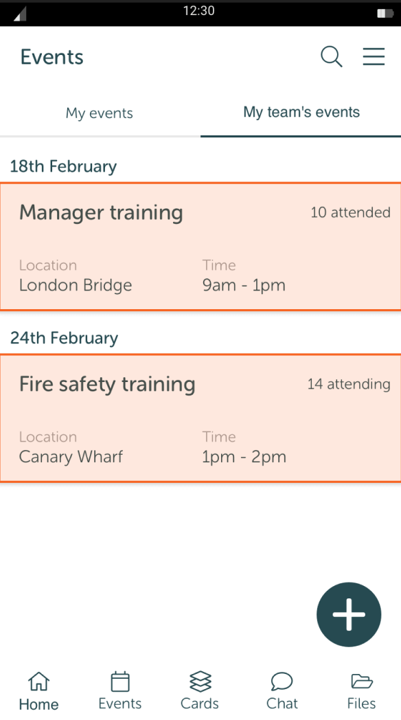
Wireframe prototype for testing.
Now it was time for some fun! I created a test area, script and objectives and both I and the product owner ran the same tests with various users in order to validate our research and gain insights where possible. I created 9 tasks to work through with users, ranging from simple recognition and single actions tasks up to multiple action tasks. We used Lookback to record our conversations with users and to allow us to rewatch and timestamp anything noteworthy.
The outcome of the tests led to 11 actions. Most actions were minor UI tweaks but there were others which would need more thought to improve. The most insightful task was test 5 where users were tasked with adding a new cohort of staff to some fire safety training. 67% of users were confused by the action because it felt like they were adding users rather than sending them an invite, which, upon further questioning, was the same feeling across the board. It was decided that we should make clearer that these users were being invited and not just added to the list of attendees.
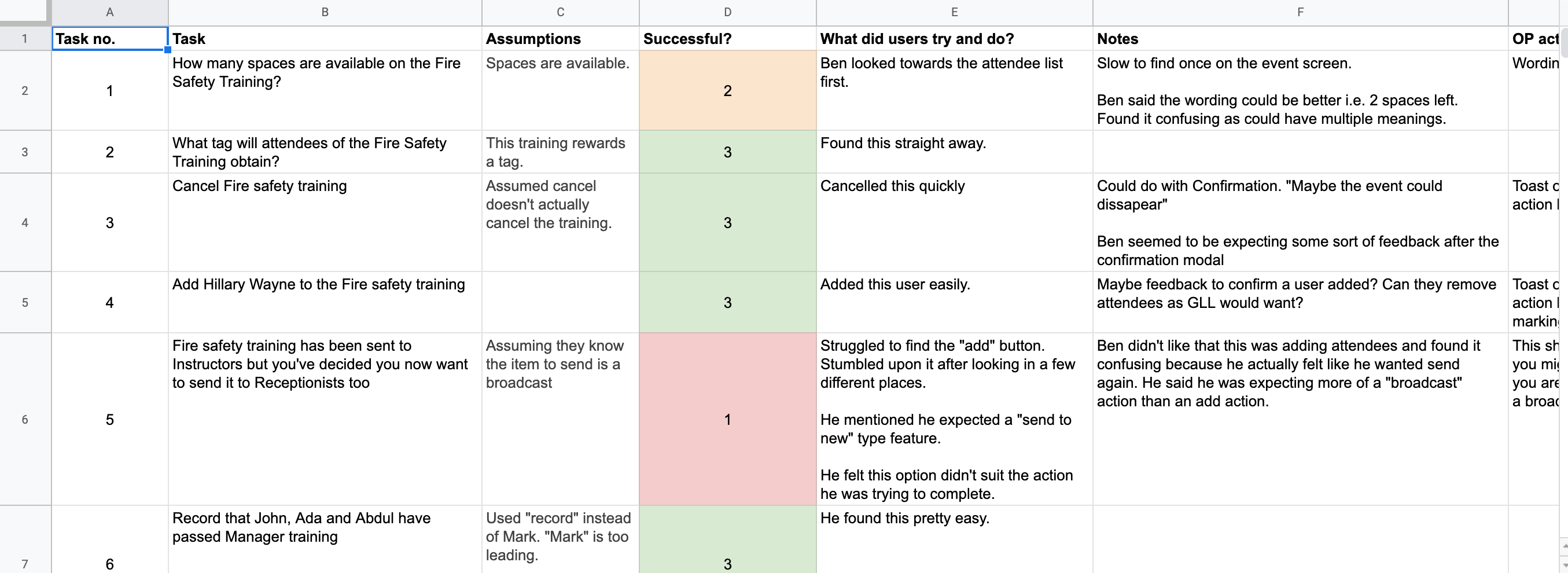
Part of the first testing feedback.
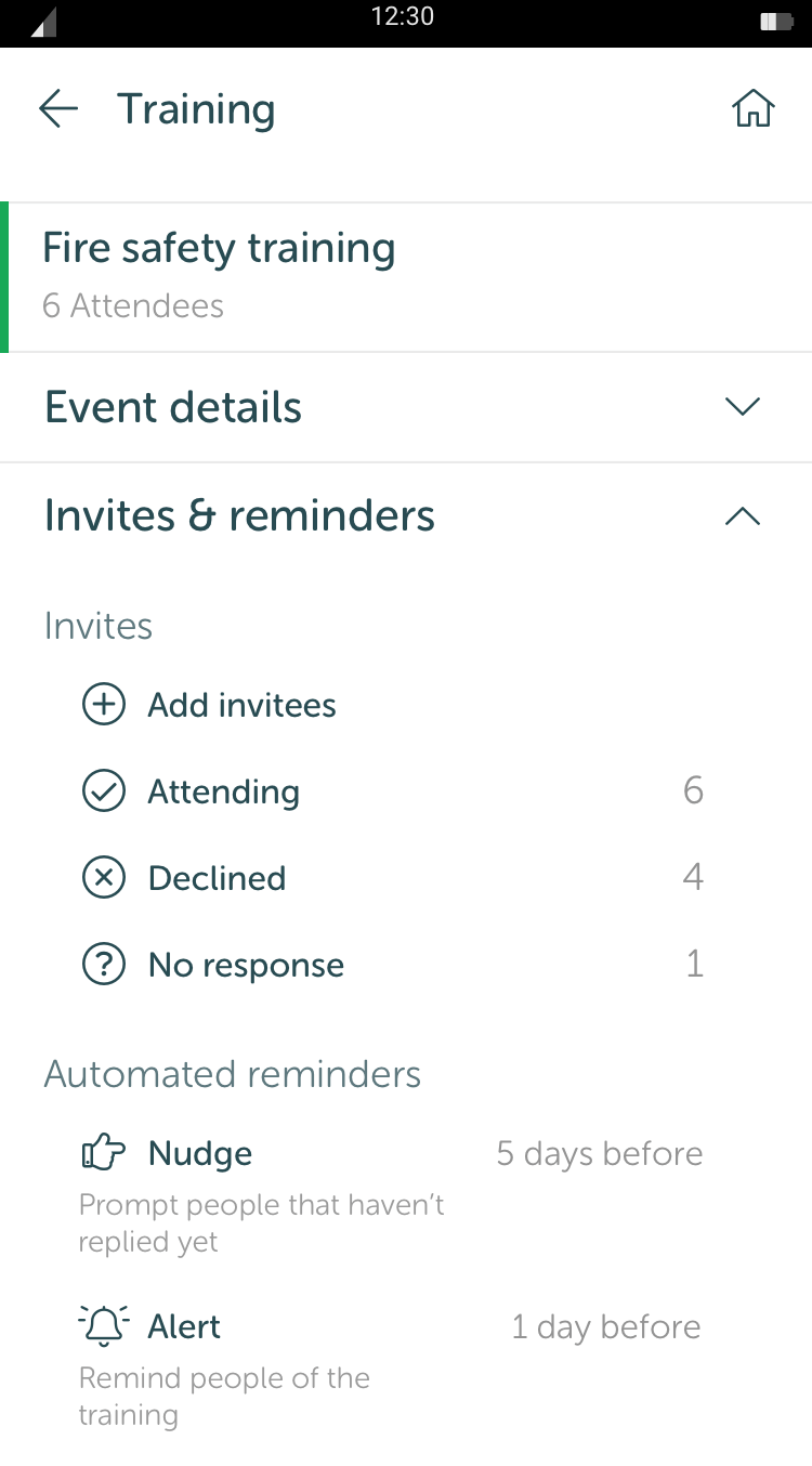
Giving invitees more context to solve the confusion mentioned above.
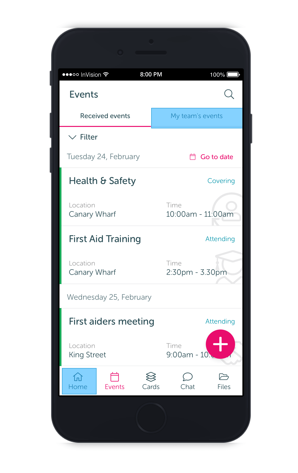
High fidelity prototype using invision
After I had completed changes based on the first test and moved from wireframes to mock ups, we ran another test to gain more feedback. This time we were left with just 5 minor UI changes. The test tasks were changed to avoid users using their familiarity with the prototype to complete tasks.
We used Invision to run high fidelity prototypes and used Lookback again as a method of recording the interviews. This gave us a great chance to test the prototype as close to a live version as we could and offer users a realistic experience of the end level product.
Overall, our testing proved very useful and resulted in fundamental changes which would have caused serious experiences issues without the testing.
After final changes were made, I created an asset list for our development team. This was based on reusable assets which already existed and a list of new assets with animated visuals.
This project went live in 2020.
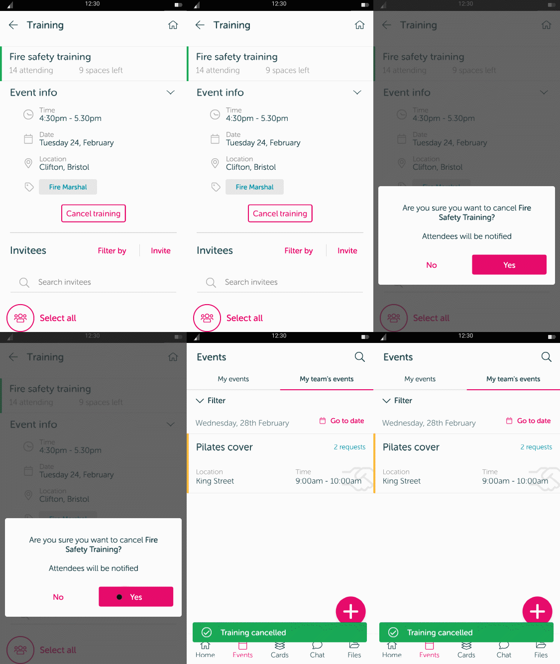
New asset visual
Improving design continuity with an atom based component library used as a single source for brand and design needs.
Read more
Redesigning the website of the UK’s number 1 theme park for a modern day audience.
Read more