OurPeople Website
Redesigning the OurPeople website with a super short turn around, adapting under world changing circumstances.
Back to My Work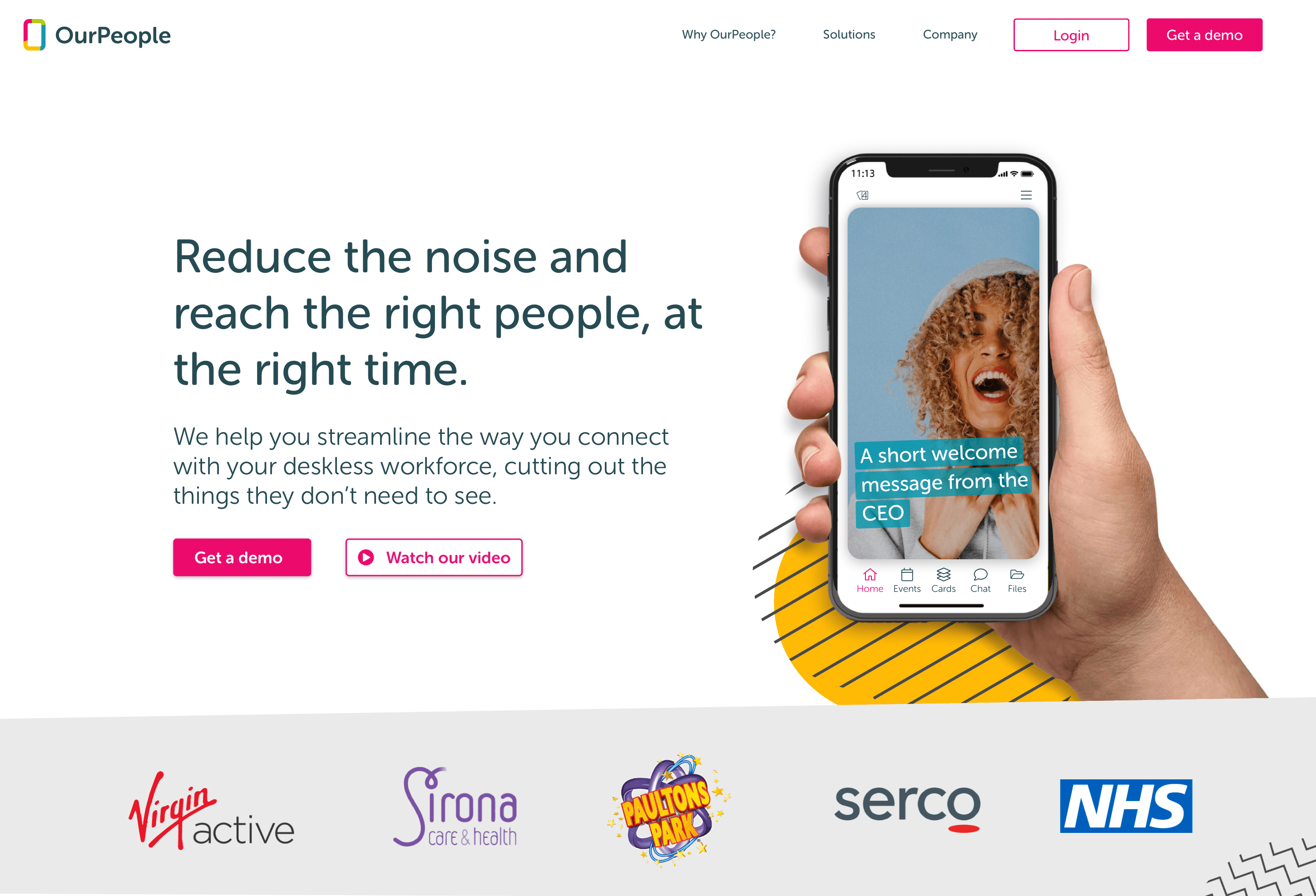
Redesigning the OurPeople website with a super short turn around, adapting under world changing circumstances.
Back to My Work

CLIENT
OurPeopleDATE
2020ROLES
Website designCOLLABORATORS
CEO Product owner Senior developerOur website was in desperate need of a redesign. We needed to include new features and do some branding updates. After spending time finessing wireframes with my colleagues, the impact of the Covid-19 pandemic was felt and we had to quickly adapt to launching a new product, which meant an extra marketing site would be required. I created an extra set of visuals to account for the new product and its features and we were able to launch both sites albeit slightly later than planned.
Sketch, Miro Wireframing, After effects, Premiere Pro
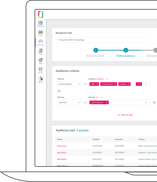
A smiley snapshot from the new site.
Redesigning anything can sometimes be a balancing act. Tech products are often being developed rapidly, so one of the key aspects is timing the redesign appropriately between large updates. It needs to cover the product thoroughly without overpromising.
We started with a sitemap to get an idea of how we wanted the site laid out and what the flow/site access points might look like. From there I created wireframes which would serve as a high level layout for the site. These changed many times during the course of the process and we ended up with higher fidelity wireframes, as we wanted to focus more on the content to help us arrange the layout most effectively.
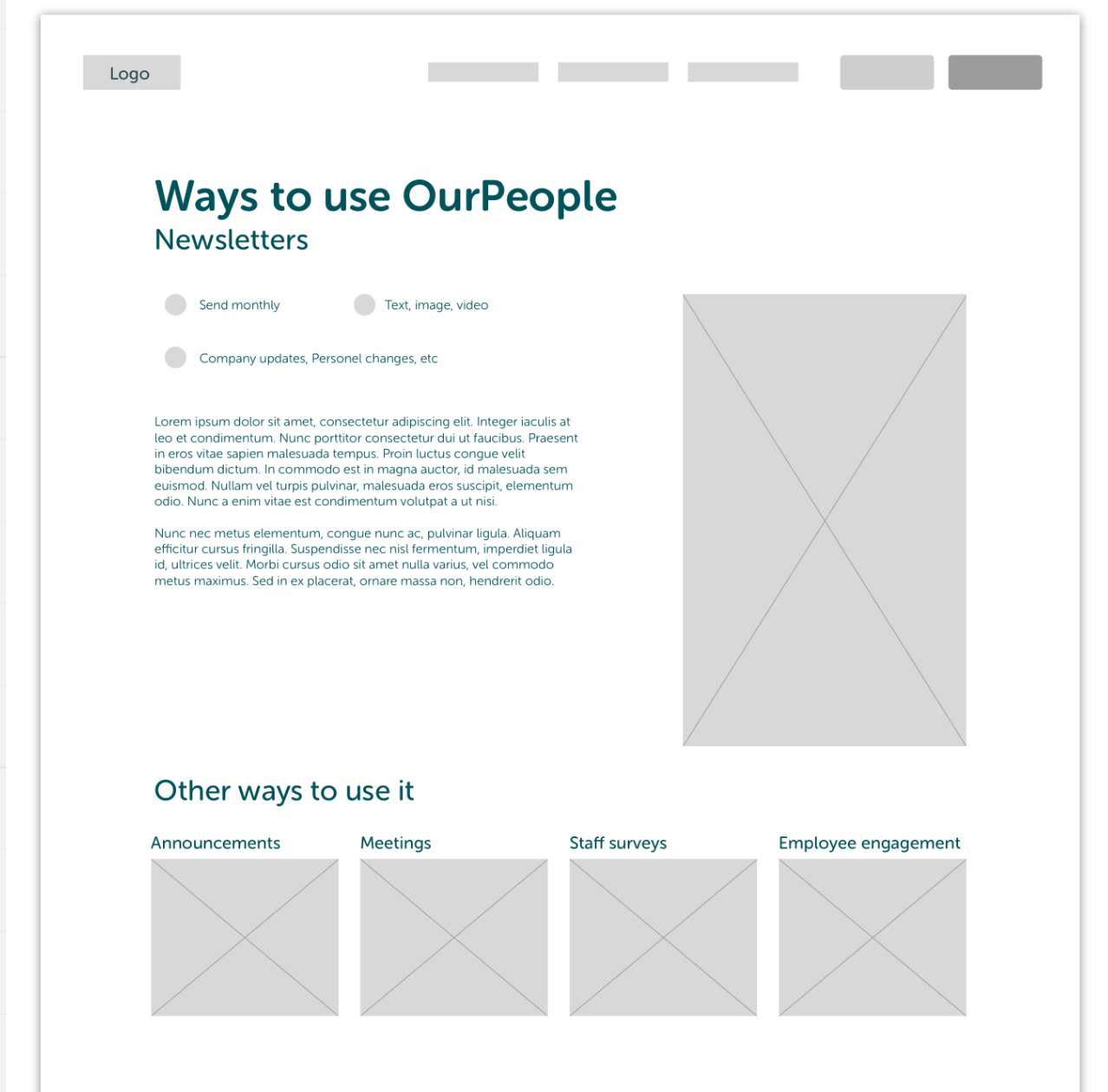
Our wireframes started very high level.
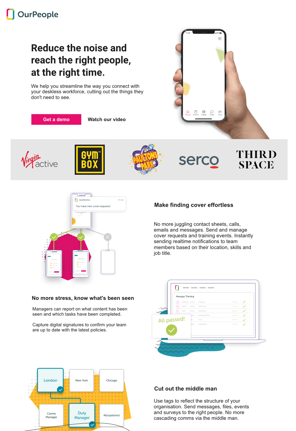
Wireframes V2 were closer to becoming designs.
At this point I was merrily working away on the full page mock ups and a proverbial spanner was thrown in the works. As the seriousness of COVID-19 became apparent, it was clear to the CEO and other stakeholders that the business would need to pivot slightly and adapt to the upcoming changes people’s lifestyles.
We decided to run with a lighter version of the product which would be known as OurPeople NOW. This new version was going to be developed super quickly and needed a marketing site to compliment it. Aimed initially as a free to use tool for the NHS and other healthcare providers, I modified some assets and parts of the site to incorporate these last minute changes.
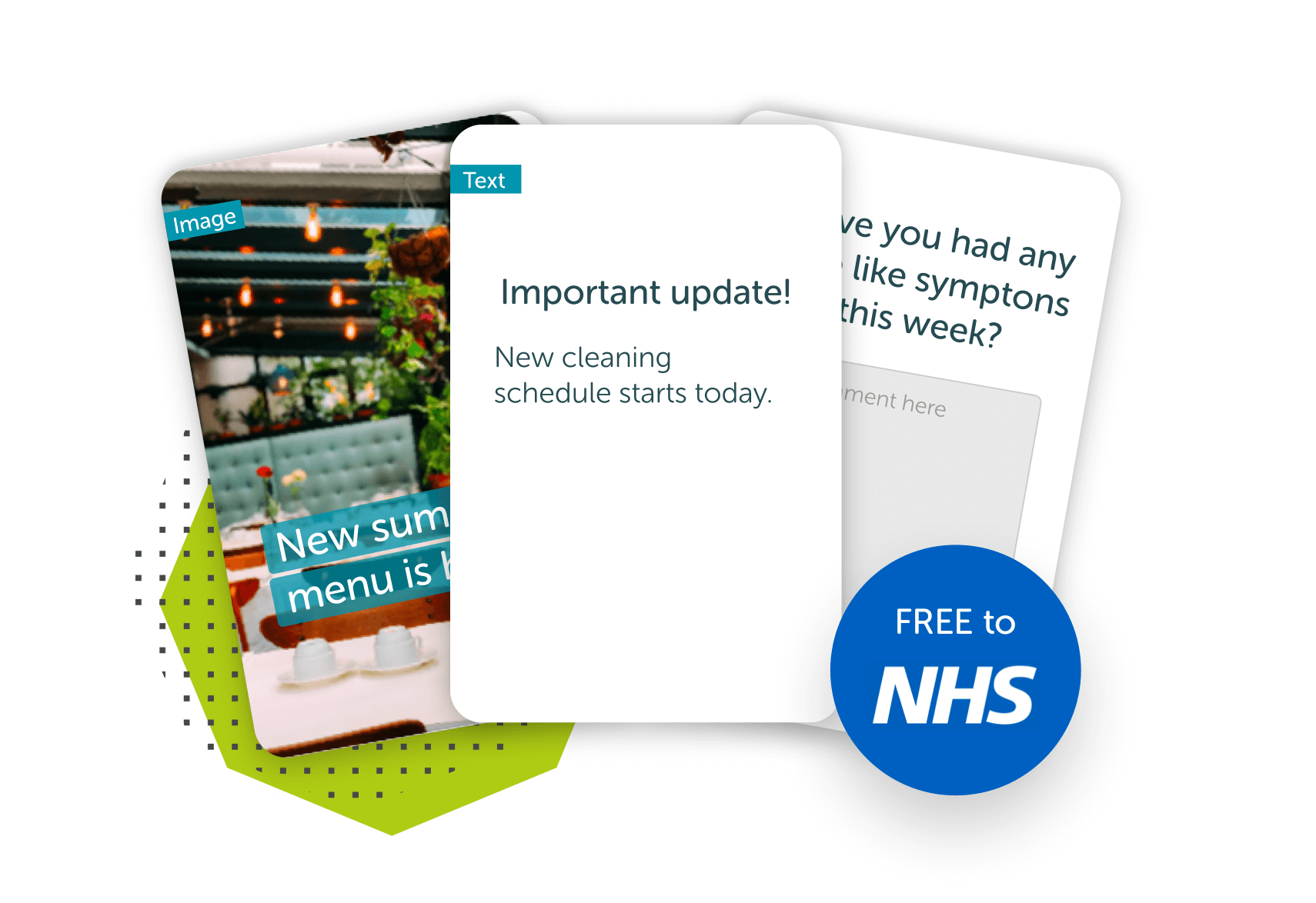
Some of the smaller adaptations we had to make.
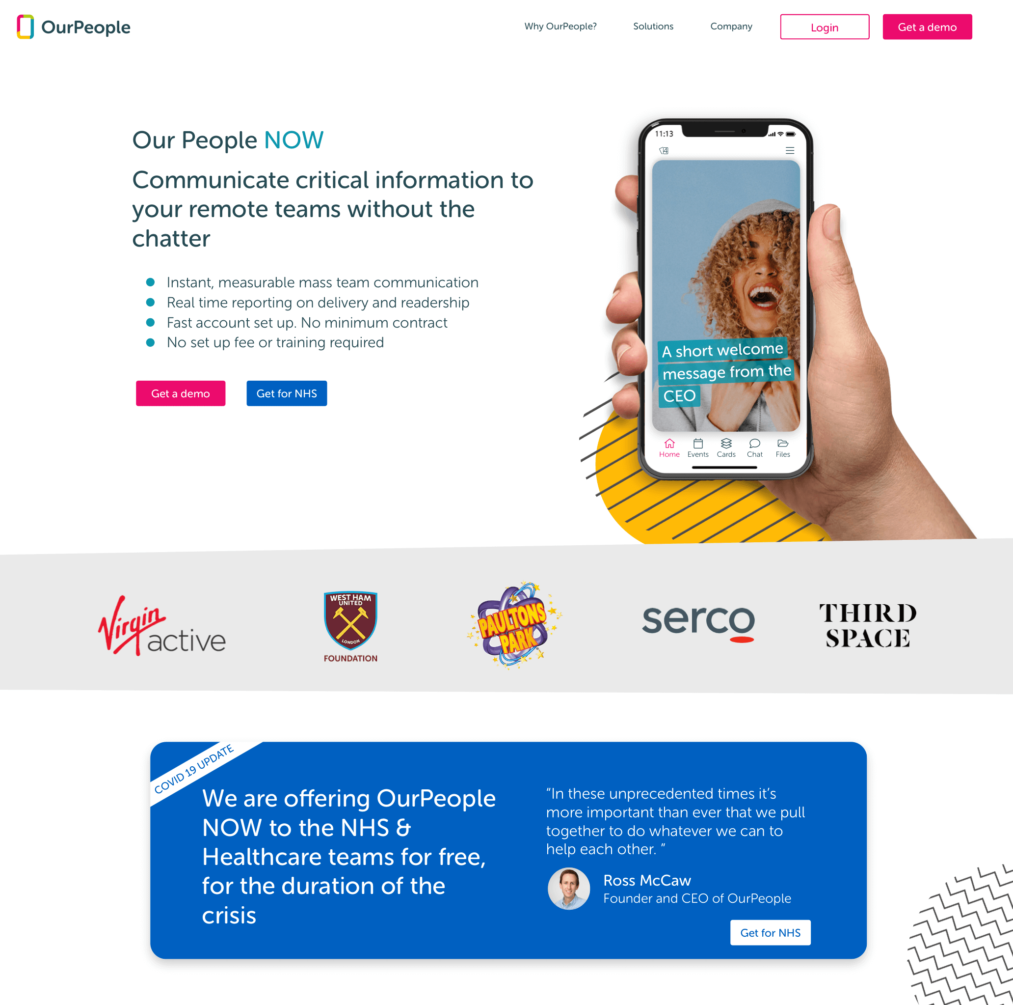
We created sister page for the new product.
After some rather rapid modifications, we finally had a solid design that would show off the core product but also our new lightweight product. These designs were created in two phases and signed off after being presented to the board by the CEO.
It then came back to me to produce assets such as the video inside the phone, the graphics and lots more before finally being sent on to the agency to build. Everyone was ecstatic with the final results which included some obstacles but shows a bit of grit, perseverance and teamwork can achieve a great end result. Check it out.
Adaptation of the free OP NOW trial was hugely successful with several NHS trusts adopting the platform to solve communication issues.
A video created for the new home page.
Creating a sleek UI for a music app for fitness studios. Matching the music to the beat.
Read more
Giving managers the power to create dynamic audiences for their content and save time doing it.
Read more