HMRC Mobile app Help to Save
Enhancing the experience for Help to Save users, new and old.
Back to My Work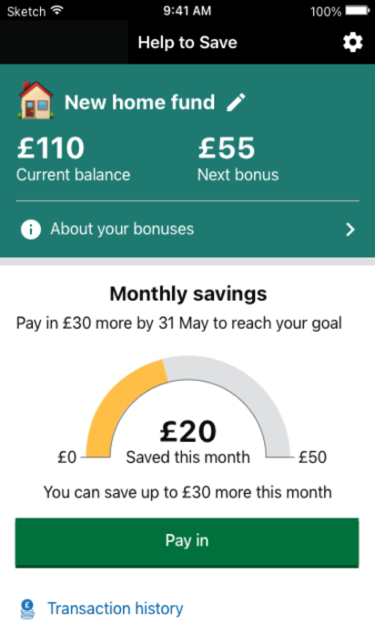
Enhancing the experience for Help to Save users, new and old.
Back to My Work

CLIENT
HMRC
DATE
2021
ROLES
UX designCOLLABORATORS
User ResearcherThe HMRC mobile app has over 500k users per month and over 100k ratings on the App and Play store at an average of 4.7 stars. It’s incredibly important to keep this loyal user base engaged so we were often iterating on features within the app to improve the experience. I was tasked with assessing the app and making improvements to help get people into the habit of saving.
Stakeholder engagement, Miro planning, User testing, Research and analysis, Wireframing, Sketch, Prototyping, User testing
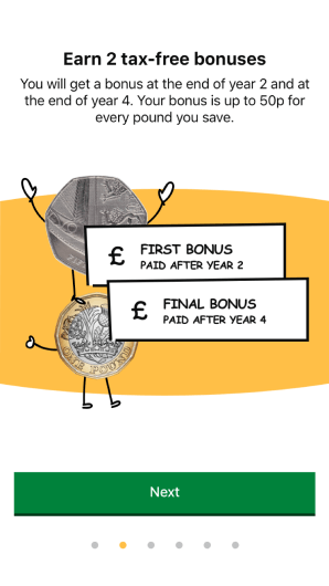
Help to Save onboarding.
The Help to Save scheme offers unbeaten savings returns for users on low incomes. They can save up to £50 pounds per month for 4 years and get 50% return at the end of 2 and 4 years.
Although the Help to Save account is incredibly popular with it’s account holders, new users tend to come from word of mouth so the experience they have can effect uptake of the account. Initial research showed some key insights which we split into upgrading the account screen, providing guidance through their 4 years to encourage saving and ensuring it was clear what happened when their accounts were coming to an end.
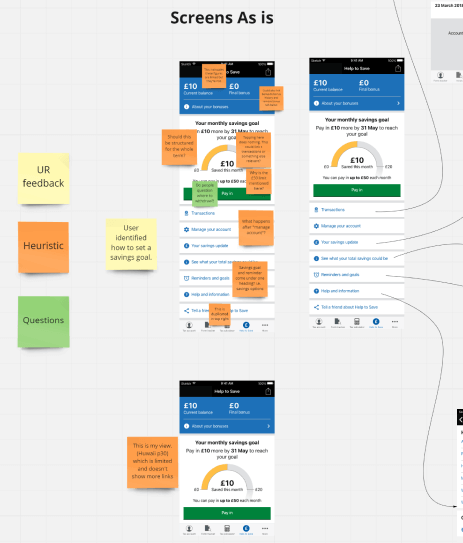
Heuristic analysis.
Although I started with the account home screen, I followed the same series of steps to understand the problems clearly. We produced a survey in order to obtain quantitative feedback, from this, we gained insights which I analysed and compared to a wealth of previous user research that had been archived. We used a panel to engage users and obtained over 1,000 responses in less than a week!
I also facilitated internal heuristic analysis workshops as well as a design crit session with HMRC design colleagues with outcomes that I affinity mapped. This approach lead to the discovery of several areas in which we could make improvements. I then completed a competitor analysis to understand how other savings accounts behave.
As part of the account screen work, some of the insights we gained were:
Based on these points, I tidied up the UI, improved the number and relevancy of the links and added features such as naming a savings goal.
Part of this brief was to “experiment” which, as some tests showed, didn’t improve the experience. However, we iterated on these designs with this feedback and users feedback on the final design was a success with 9 out of 10 saying the design and features were an improvement over the current vesion they were using.
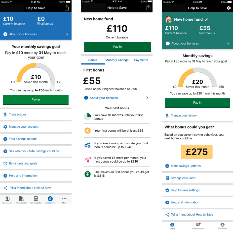
Before and after screens.
The next focus was on increasing the amount and frequency in which users saved. We had to be cognisant of the ability users would have to pay extra into their account. The stakeholders has concerns over pushing people to pay in more than they could afford and put themselves in a difficult position.
Based on our survey feedback, I mapped key points in the 4 year period where users could benefit from some nudges and guidance to help them develop a savings habit, which was the original point of the account. A lot of these centred towards the way the bonuses worked as users often commented that it was complicated, if they didn’t pay in for a month, they missed that months worth of contributions.
Some interesting user research from multiple users was that they didn’t want the app to be too “forgiving”. They wanted to know that if they missed a payment, there would be repercussions in the form of missed savings opportunites. They felt that being too “nice” wouldn’t help them form a habit. This influenced the tone of our content a great deal.
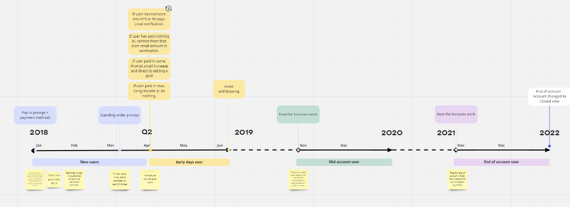
Account nurturing timescales.
The last area to focus on was the end of account scenario. As the scheme only started nearly 4 years before this work, users were not yet at the point where they had claimed their final bonus payment. There were some things users had to do at the end of the 4 year period such as check the account details for the bonus payment were correct, ensure they cancelled standing orders, etc.
One of the biggest insights that came our of testing was that users were left in limbo after their account ended as they can only have an account once. There was no guidance or any subsequent support set up for them so after some research and discussion with SMEs, I included information on the Money Helper service, a free GOV backed service where users could find out next steps for saving and continuing the habit they had built up.
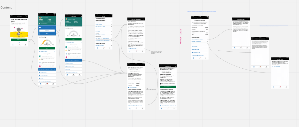
End of account planned changes.
The project overall was successful, and stakeholders were confident that the data over the next year would see accounts flourish and less support queries.
An EU-exit project providing traders with a service to declare imports and exports online.
Read more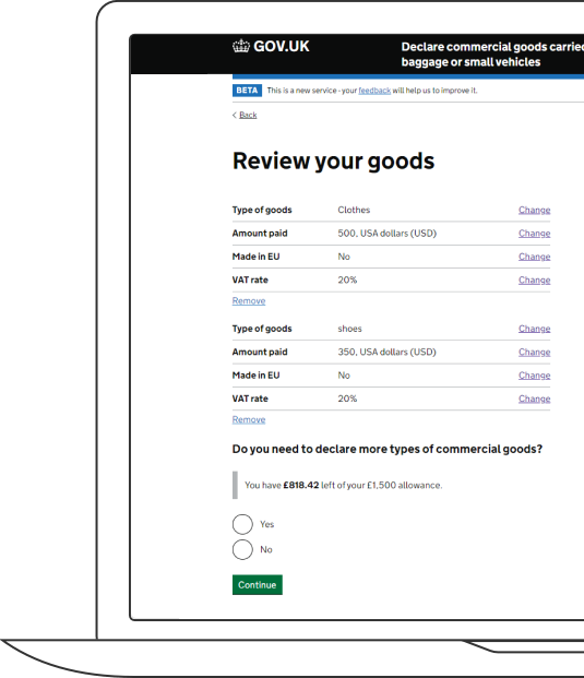
Improving design continuity with an atom based component library used as a single source for brand and design needs.
Read more